
Hit the Bullseye with These Dos and Dont's of Logo Design
- Lakshita Taneja

- Aug 8, 2024
- 2 min read
Your logo is the face of your brand. It's the first impression you make on potential customers. A well-designed logo can leave a lasting impact, while a poorly executed one can harm your brand's reputation. So, what makes a great logo? Let's dive into the dos and don'ts.
Do's of Logo Design
Keep it simple:
A good logo is easy to remember and recognize. Avoid cluttering it with too many elements.
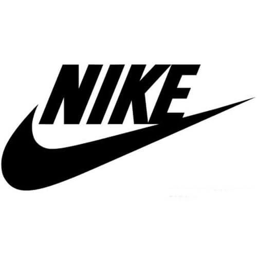
For instance; Nike's swoosh is a perfect example of a simple yet iconic logo.
Make it relevant:
Your logo should reflect your brand's essence and values. Consider your target audience and industry when designing.
For instance; The WWF's panda logo clearly represents the organization's focus on wildlife conservation.

Ensure versatility: Your logo should look good in various sizes and formats, from small social media icons to large billboards.
For instance; The Apple logo is another minimalist design that is instantly recognizable.

Choose colors wisely: Colors evoke emotions. Select colors that align with your brand personality and appeal to your target audience.
For instance; Tiffany & Co. uses a specific shade of blue associated with luxury and elegance, perfectly aligned with its brand.

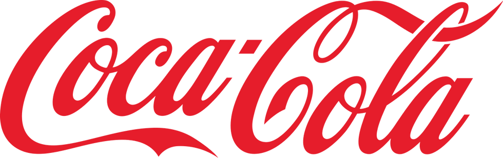
Invest in typography: Fonts can make or break a logo. Choose a font that complements your brand's style and is legible.
For instance; Coca-Cola's distinctive script font is iconic and contributes significantly to the brand's overall image.
Don'ts of Logo Design
Don't follow trends: While staying updated is important, avoid creating a logo that looks like everyone else's.
Don't be too literal: A logo doesn't always have to represent your business directly. Sometimes, a symbolic approach can be more effective.
Don't use complex imagery: Intricate details can be lost when scaled down, making your logo unrecognizable.
Don't overuse fonts: Limit your logo to one or two fonts to maintain a clean and professional look.
Don't ignore negative space: Negative space can add depth and meaning to your logo. Explore its potential.
At JLT Design Studio, we understand the importance of a strong logo. Our team of experienced designers can help you create a logo that captures your brand's essence and resonates with your target audience. Contact us today to discuss your logo design needs.
Remember, a great logo is an investment in your brand's future.


Comments